
Back in 2011, only 8% of emails were opened on mobile devices. By the end of 2014 that figure had grown to 53%. In other words, over half of all email opens are now on smartphones and tablets. The most recent research suggests that mobile email will account for 15 to 70% of email opens, depending on your target audience, product and email type.
What does this mean for your email marketing campaign?
The good news is that because people are checking their emails more often on mobile devices, they're more likely to see your newsletters, e-zines and promotions. The bad news is that an email designed to be read on a desktop or laptop could look terrible on a smartphone, resulting in your recipients deleting your message instead of reading it.
How to make sure the emails you send for your business look great on mobile devices:
1. Responsive Design

Responsive web design is the practice of building pages in a way that they are usable regardless of which device is used to access them. Ensure that you are using a responsive email design so that your email will automatically fit the screen on which it's being viewed, and will look the way it should whether on a smartphone, tablet or desktop.
2. Clarity of Message
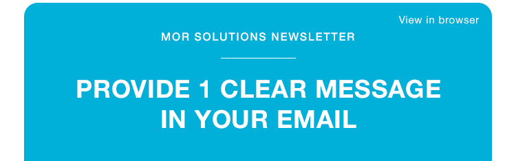
Put the most important information at the start of the email. Your readers could be on the go and easily distracted if you don't get to the point right away. Split the text of your emails into clear sections to assist with mobile-email scanning. This can be done with header text, dividing lines, numbered paragraphs or by using a relevant image to notate a block of the email. Compelling mages are worth a thousand words but remember to keep it clean and simple when optimising your emails for mobile to avoid download delays.
3. Clear Call to Action

Use buttons for calls to action (e.g. 'Read more', 'Buy now') instead of links. Buttons are not only more visible on a mobile screen, they're also easier to interact with. 'Thumb-friendly' buttons are at least 46 pixels squared with plenty of space around them. Important call to action buttons should either be left-aligned or 100% width, so that it's easier for a left- or right-handed user to reach. Ensure that these buttons direct readers to a mobile-friendly web page. It can be frustrating for an on-the-go reader to click from an email to a page that doesn't render correctly on a smartphone.
How we can help
We have helped our clients with their email marketing strategy and created beautiful responsive design for their digital communications (website and email). For further advice on the importance of responsive email to your digital content strategy, contact us today.


